Substack's UI and 1Password just cost me $2,023
A quick guide on how to accidentally spend $2k in two clicks live on a client Zoom call.

Disclaimer
This has been refunded and sorted with Substack via the publisher in question 🤞 (who was very quick to follow up thankfully). More discussion on Hacker News.
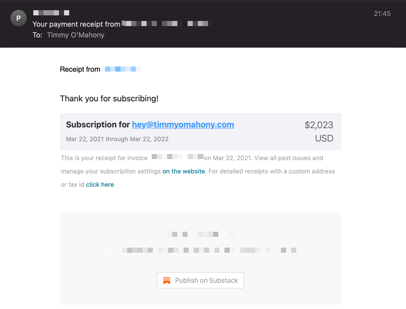
As part of a Zoom call today, I tried to sign up for a $10 monthly subscription on a Substack page to test the user journey. I paid $2,023.

After frantically failing to prevent the order going through and then grimly checking my email and banking app to see the confirmation, I wondered "wtf just happened"?
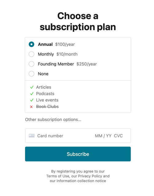
So I went back to the sign-up form for a closer look. Here's the form:

To state the obvious: there is no $2,023 plan here. There is a "founding member" option, but I'm sure I didn't click that?
Wait, what did I do? I'm certain I selected "monthly $10", then I opened 1Password and clicked my saved card details. Then I hit "Subscribe".
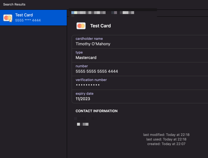
Ok, well let's have a look at my card details for a second:
 I recreated a test card to avoid spending $4046 in one day on Substack
Expiry date is 2023 😑. Let's just see ...

Oh God. There's a hidden input. With the word "year" in it. That lets you set your own annual subscription payment value. To any amount.

Oh great, it also automatically selects this option when that text input value changes. And there's no confirmation box 🤦🏼
Aaaaaahhhhhhhhhhhhh
The penny drops. When I've clicked my card details in 1Password, it's entered my expiry year in the hidden, custom subscription amount box (I'm not sure why - is this a 1Password bug? *). Because this box has now changed value, the Substack UI has automatically selected this option. I've then hit "Subscribe" before I had time to notice and 💸 $2,023.
So is this a freak edge case with 1Password and a distracted user or a glaring design oversight with the Substack UI?
I think it's probably a small bit of both, but I definitely shouldn't be able to accidentally charge myself $2k in two-clicks
Here are some design thoughts:
- Don't put subscription options and payment in the same place. This is a broader issue, but don't present options and payment beside each other. Make it two steps: choose first, confirm and pay after.
- Be very careful with custom donation amounts. If you allow users to select their own subscription or donation amounts, make sure to confirm it with them before continuing, particularly if it's X times the regular amount.
- Don't hide inputs around payment forms. If you have hidden inputs that control payment amounts, don't hide them. Dynamically add them via JavaScript after the user manually clicks something. In this case, there shouldn't be a hidden text input in the background that can be misinterpreted by the browser/plug-in.
- Don't auto-select or auto-change options. Don't automatically select an option based on criteria belonging to that option changing.
Update #1 - As a few people have mentioned on Hacker News, it's likely that having the word "year" in the input field causes 1Password to misinterpret it and enter the expiry year.
Update #2 - A very friendly ex-1Password employee reached out to explain how this might have happened. As suggested above, the "year" field is the problem, but it's a bit more subtle than just that. 1Password searches for all documents loaded, which in this case includes embedded iframes from Stripe. It sees the correct "year" field in the Stripe iframe and adds the expiration there. But it also sees the incorrect "$250/year" in the top-level Substack field and adds the expiry there too (as it's in a separate document). Understandable behaviour.
Update #3 - A current 1Password employee also kindly reached out to explain that they had made internal changes (presumably to the plugin) to handle this specific case so that it wouldn't happen again.